in beta
in beta
Component Checklist
right in Figma
Component Checklist
right in Figma
Component Checklist
right in Figma
Check the status of every design system contribution
check the status of every
design system contribution
Check the status of every design system contribution
Request Access
Request Access
component checklist
Button


2
API Alignment
Gather web and app API requirements
Create a table overview
API alignment meeting
Apply feedback to final document
Definition of Ready
Dynamic component in Figma
Add and connect component specific tokens
Run documentation plugin
Review by peer
component checklist
Button
2
Definition of Ready
Dynamic component in Figma
Add and connect component specific tokens
Run documentation plugin
Review by peer
component checklist
Button
2
Definition of Ready
Dynamic component in Figma
Add and connect component specific tokens
Run documentation plugin
Review by peer
Mark 'em down
-beside your canvas
Mark 'em down
-beside your canvas
Mark 'em down
-beside your canvas
Register progress in a single click, then get back at it.
Allowing the designer to focus on the task at hand.
Register progress with one click without leaving the artboard. Allowing the designer to focus on the task at hand.
component checklist
Button
2
Consolidate Design
Gather use cases
Identify discrepancies
Create a new solution
Consolidation meeting
API Alignment
Gather web and app API requirements
Create a table overview
API alignment meeting
Apply feedback to final document
Definition of Ready
Dynamic component in Figma
Add and connect component specific tokens
Run documentation plugin
Review by peer
component checklist
Button
2
Definition of Ready
Dynamic component in Figma
Add and connect component specific tokens
Run documentation plugin
Review by peer
component checklist
Button
2
Definition of Ready
Dynamic component in Figma
Add and connect component specific tokens
Run documentation plugin
Review by peer
BUTTON
BUTTON
BUTTON
BUTTON
BUTTON
BUTTON
BUTTON
BUTTON
BUTTON
BUTTON
BUTTON
BUTTON
BUTTON
BUTTON
BUTTON
BUTTON
BUTTON
BUTTON
BUTTON
BUTTON
BUTTON
BUTTON
BUTTON
BUTTON
BUTTON
BUTTON
BUTTON
BUTTON
BUTTON
BUTTON
BUTTON
BUTTON
BUTTON
BUTTON
BUTTON
BUTTON
BUTTON
BUTTON
BUTTON
BUTTON
BUTTON
BUTTON
BUTTON
BUTTON
BUTTON
BUTTON
BUTTON
BUTTON
BUTTON
BUTTON
BUTTON
BUTTON
BUTTON
BUTTON
BUTTON
BUTTON
BUTTON
BUTTON
BUTTON
BUTTON
BUTTON
BUTTON
BUTTON
BUTTON
BUTTON
BUTTON
BUTTON
BUTTON
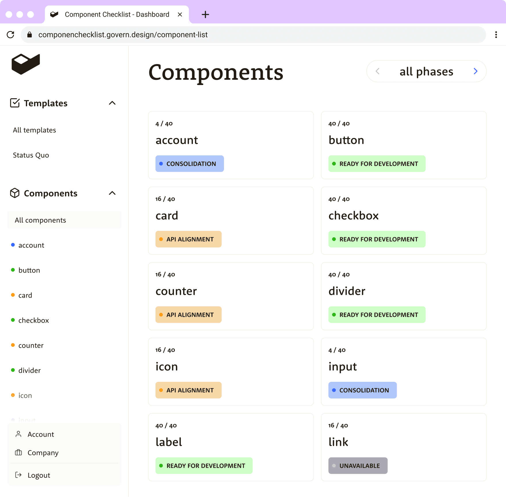
See every component
in one dashboard
See every component
in one dashboard
See every component
in one dashboard
All components are displayed in a single overview,
no matter the file or page - giving you constant oversight.
All components are displayed in a single overview, no matter the file or page
- giving you constant oversight.
All components are displayed in a single overview,
no matter the file or page
- giving you constant oversight.
3 / 40
Card
API ALIGNMENT
go to figma page
API alignment
Gather web and app API requirements
Create a table overview
API alignment meeting
Apply feedback
3 / 40
Card
API ALIGNMENT
go to figma page
API alignment
Gather web and app API requirements
Create a table overview
API alignment meeting
Apply feedback
3 / 40
Card
API ALIGNMENT
go to figma page
API alignment
Gather web and app API requirements
Create a table overview
API alignment meeting
Apply feedback
3 / 40
Card
API ALIGNMENT
go to figma page
API alignment
Gather web and app API requirements
Create a table overview
API alignment meeting
Apply feedback
Components
all phases
4 / 40
account
consolidation
40 / 40
button
ready for development
16 / 40
card
API Alignment
40 / 40
checkbox
Ready for development
16 / 40
counter
API Alignment
40 / 40
divider
Ready for development
16 / 40
icon
API Alignment
4 / 40
input
Consolidation
40 / 40
label
Ready for development
16 / 40
link
unavailable
Distributed everywhere
Distributed everywhere
Distributed everywhere
The checklist template is automatically sent to all widget instances – ensuring that every designer follows the compliant route for a new contribution.
The checklist template is automatically sent to all widget instances – ensuring that every designer follows the compliant route for a new contribution.
The checklist template is automatically sent to all widget instances – ensuring that every designer follows the compliant route for a new contribution.

Create your own checklist template
Create your own checklist template
Create your own checklist template
Create a procedural checklist to guide designers in creating a compliant contribution. Divide tasks into phases and arrange them in sequential order.
Create a procedural checklist to guide designers in creating a compliant contribution. Divide tasks into phases and arrange them in sequential order.
Create a procedural checklist to guide designers in creating a compliant contribution. Divide tasks into phases and arrange them in sequential order.
designsystems.com
Keeping design system contributions in check
Keeping design system contributions in check
Keeping design system contributions in check
Want to ensure that your design system contributions are organized and consistent? Learn about the value of a component matrix and checklist for keeping everyone on the same page.
Want to ensure that your design system contributions are organized and consistent? Learn about the value of a component matrix and checklist for keeping everyone on the same page.
Want to ensure that your design system contributions are organized and consistent? Learn about the value of a component matrix and checklist for keeping everyone on the same page.

Join us on the journey
Join us on the journey
Join us on the journey
Sign up to get updates on the widget. Mailchimp handles our subscriptions.
Sign up to get updates on the widget. Mailchimp handles our subscriptions.
Sign up to get updates on the widget. Mailchimp handles our subscriptions.